Technical analysis – Learn the basics
The content of this article
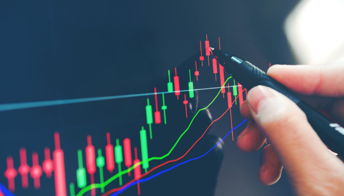
Technical analysis is a method of analysis that uses price graphs and charts in order to predict future price changes. With the help of different tools, strategies and indicators you try to see whether a price will rise or fall in the future.
Price = the sale price at a particular moment of a share, index fund or commodity
A common saying in technical analysis is “everything is shown in the chart”. For example, if a company releases a bad report, it will show in the price chart. According to many technical analysis purists, you should therefore never have to even glance at anything other than the chart when predicting future movements.
Fundamental analysis is the opposite of technical analysis. In fundamental analysis you analyze and study current results, products, markets etc.
Technical analysis works on all types of price charts. Here are some examples of areas where technical analysis is commonly used:
- Shares
- Index funds
- Commodities
- Currencies
- Cryptocurrencies
The video above explains the basics of technical analysis
Tools, Strategies & Indicators within Technical Analysis (TA)
There are a lot of different tools, indicators and strategies within TA. In this guide, we will explain the most common and arguably the most useful ones.
Candlestick Charts
When you attempt a technical analysis, the first thing you need to do is set your analysis software to show either daily, weekly or monthly charts. If you choose weekly, for example, every time period will be one week. This means that every point of data will represent one week, i.e. every bar in a bar chart or candlestick chart represents one week.
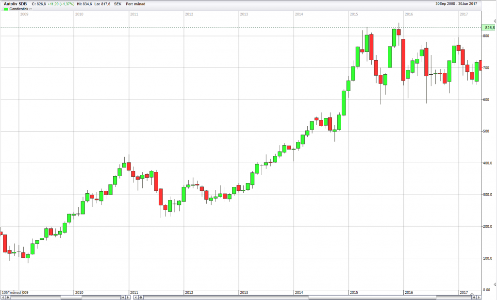
A candlestick chart is a normal chart that shows the price development during a specific time period. It is a price chart, but instead of lines it contains “candles”. Every candle represents a selected time period and each bar has a body with tails above and/or below the body.
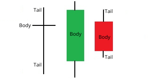
The black vertical lines that form above and below the body are called tails. The red and the green box are called body. The body can be either red or green, or just be a line.
- Green body = Price has increased
- Red body = Price has decreased
- Only a line = Price is unchanged
A candle/bar shows a selected time period. You can adjust the settings, so that every bar represents a second, an hour, a day, a month or even a year.
If you choose to have every bar represent a day, it is usually called a daily chart or daily bar chart. If you instead choose to have every bar represent a month, it is a called a monthly chart.
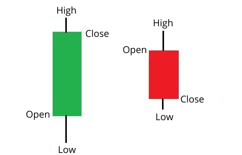
1. Opening and closing price (body):
If the opening price is higher than the closing price, it means that the price has gone down during the selected time period. That will create a red body. This body consists of the opening price (at the top of the body) and the closing price (at the bottom of the body).
If the situation is reversed, i.e. the price has increased during the time period, the bar will be green. In that case, the opening price will be at the bottom of the body and the closing price will be at the top of the body.
If only a line is shown, that means that the opening price and closing price is identical.
2. Tails (highest and lowest price during the time period)
The vertical lines that are created above and below the body, show the highest and lowest price reached during the time period.
Example:
Let us look at a Tesla share in a monthly chart. On the first day of the month, the Tesla opening price is 100 dollar. During the month, the price is decreased to 90 dollar and later increases to 110 dollar at the highest. By the end of the month the share price is 105 dollar, which ends up being the closing price. The bar will then look like this:
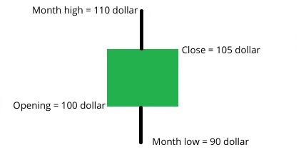
If you would have bought Tesla shares at the beginning of the month and sold them by the end, you would have made 5 dollar profit per share and had owned the share for 1 month.
Trends
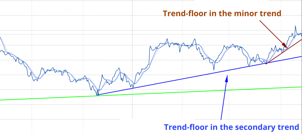
In order to analyze and identify trends in a price graph, you need technical analysis. You want to find information that tells you whether the price is falling or rising. You look at three trends in particular:
- Primary trend = Long-term trend (several years)
- Secondary trend = Intermediate trend (weeks to months)
- Minor trend = short-term trend (days to a couple of weeks)
In order to successfully identify whether a price is in a rising or falling trend, there are plenty of tools at your disposal. Here are the most common ones:
- Trend Lines
- Moving averages
1. Trend lines
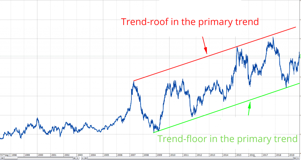
Trend lines are lines drawn on a graph. With the help of these straight lines you can connect the highest and lowest price point. The resulting space between these lines is called a trend channel.
- The line connecting the tops is called trend-roof
- The line connecting the bottoms is called trend-floor
If the lowest price points are rising so that the line is pointing upwards, that is a sign of a rising trend. If the highest price points are also rising, it is a strong rising trend.
If the highest price points are getting lower, that is instead a sign of a falling trend. When the lowest price points are decreasing as well, it is a sign of a strong falling trend.
When the highest price points are decreasing, while the lowest are increasing, the price is consolidated, i.e. no clear trend can be read from the data.

2. Moving averages
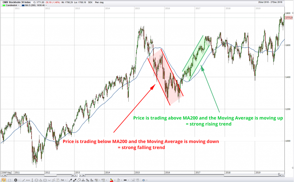
With moving averages you can determine whether a trend is rising or falling. A moving average is an average price of the last days, weeks or months. If you adjust your settings to show the moving average for the last 200 days, that setting will be called MA200.
MA200 = The average price based on the closing price of the last 200 days.
In order to determine the direction of the trend, you can follow the following guidelines:
- Moving average points upward = Rising trend/positive
- Moving average points downward = Falling trend/negative
- Price is above the moving average = Rising trend/positive
- Price is below the moving average = Falling trend/negative
Support and Resistance
Technical analysis is often used to identify possible support and resistance in a price.
Support = Prevents the price from falling (buyers starts to buy which increases the price)
Resistance = Prevents the price from rising (sellers starts to sell which decreases the price)
What you look for, is simply the price level where the price is likely to turn downwards or upwards. To find these levels you need to look at the graph and identify at what levels the price has turned previously, and at what price level it is likely for buyers and sellers to step in and start trading. There are many ways to identify this pattern, but these are the most common:
- Analyzing trend lines
- Analyzing previous price bottoms and tops
- Analyzing trading volumes
1. Analyzing trend lines
Since many analysts uses trend lines, you can sometimes predict that the price will turn at the trend line. It is more likely that the price will turn against the trend line, the older the trend line is.
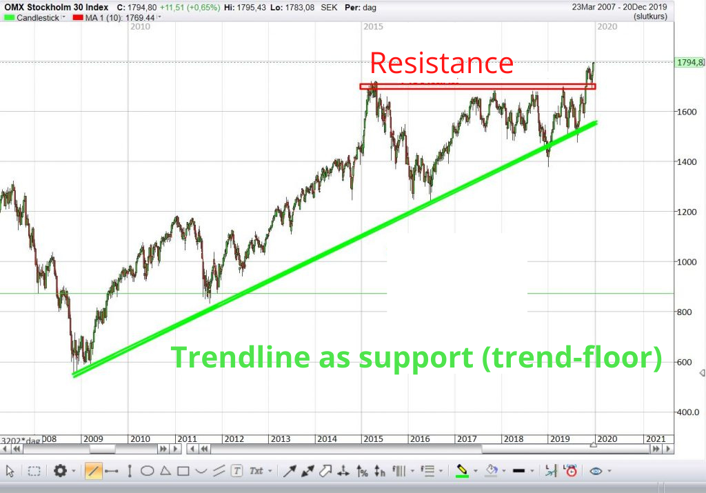
If the price should decrease towards the green line, it is likely that more buyers than sellers will enter the fray, which in turn will begin an increase in price.
2. Analyzing previous price bottoms and tops
If a previous price has turned at a specific level, it is probable that it will turn again when reaching that price level the next time. At certain price levels buyers will determine that the price is so low that they want to buy more, or the sellers will feel that it is too expensive and want to sell.
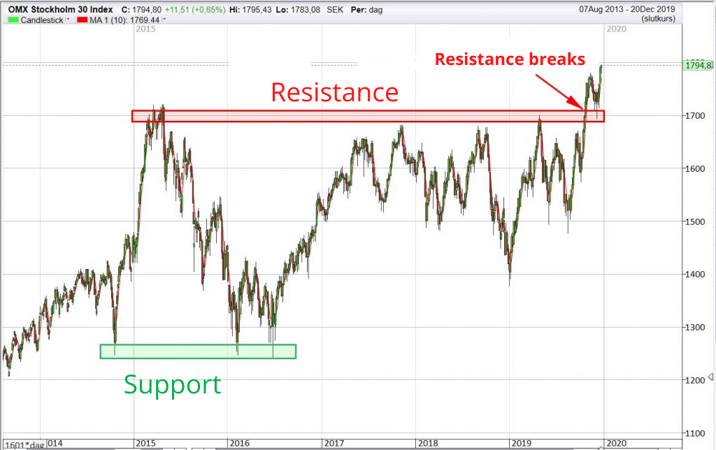
Chart Patterns and Formations
There are a number of patterns that regularly appear in graphs/charts. By interpreting these patterns you can draw conclusions regarding the direction of a price change. Smart people have figured out the probability of a price change’s direction when specific patterns appear in a chart. These formations/patterns are separated into two types:
- Reversal patterns (signals that the price trend probably will reverse)
- Continuation patterns (signals that the price trend will probably continue in the same direction)
There are a lot of different types of patterns and formations, but here are the most commonly used:
- Head-and-shoulder formation
- Double Top & Double Bottom
- Ascending Triangle
1. Head-and-shoulder formation
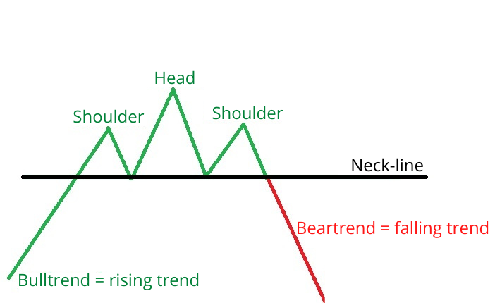
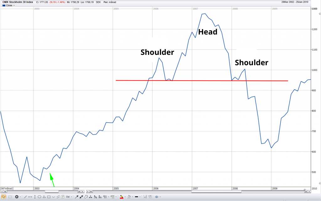
Head and shoulder formation is a reversal pattern. It indicates that the trend is about to reverse. If the trend was rising in to the formation then the trend will probably be falling after the formation is formed and vice versa.
2. Double Top and Double Bottom
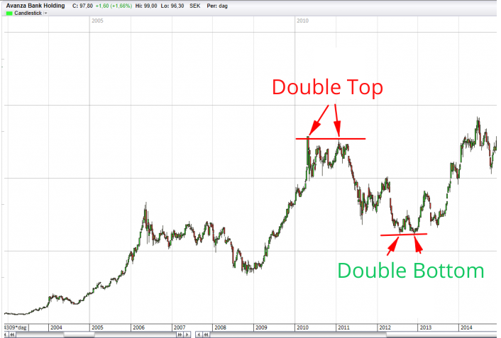
A Double Top and Double Bottom are two reversal patterns that signals a price trend will reverse. A Double Top is just what it sounds like, two tops where the price previously has changed at the same price level. These two tops creates a formation that likely will change the price trend from rising to falling.
A Double Bottom on the other hand, is just two bottoms that will likely result in a falling trend turning into a rising trend.

3. Ascending Triangle
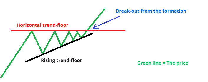
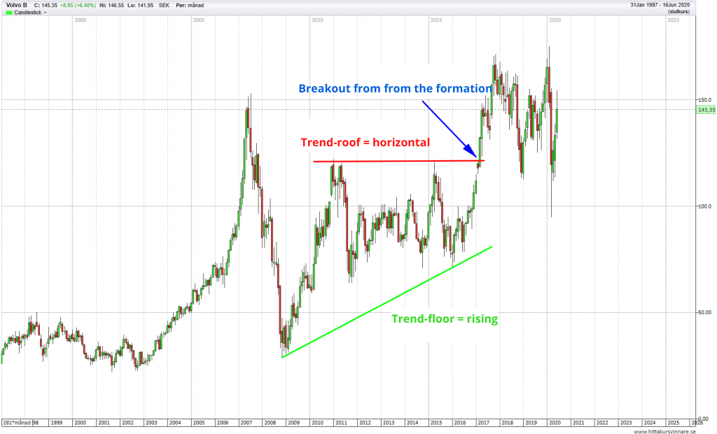
An Ascending Triangle is a continuation pattern. That means that the price most likely will continue in the current direction from when the Ascending Triangle started to appear. When the price breaks out from the pattern it is usually called a “Breakout”
An Ascending Triangle is created when the bottoms are getting higher and higher, while the tops stand unaffected. The trend tops are in other words moving horizontally while the trend bottoms are rising.
Candlestick Patterns
You can use Candlesticks to read patterns and formations that are formed in the graphs. Just like with general patterns, there are continuation patterns and reversal patterns.
The formations can consist of:
- One single candle
- Multiple candles that together form a pattern
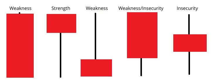
1. Single Candles
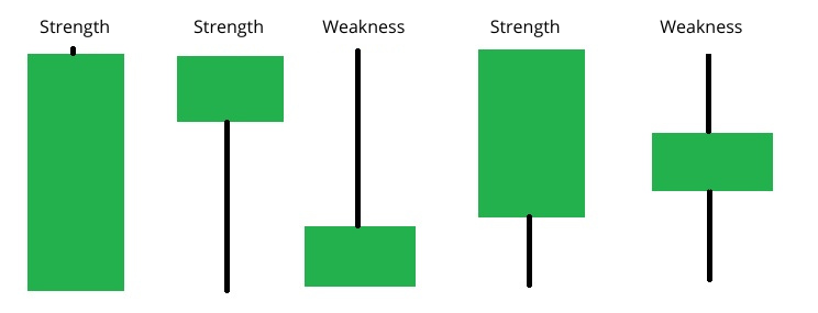
Every candle gives a probability of how the next candle will look. A positive candle hints that the next candle will probably be a positive one as well, i.e. the price is rising. A negative candle hints that the next candle will probably also be negative.
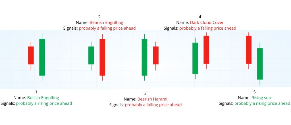
2. Multiple candles that together form a pattern
You can add multiple candles together into one formation. More candles gives a higher probability rate, i.e. that the price direction will continue in the direction that the pattern suggests.
Indicators
In programs/platforms there is a bunch of different indicators to choose from. An indicator is a programmed function that visualizes different factors. The indicators measure and show different things, for example strength in a trend (momentum) and volatility (by how much a price is changing).
Here are some examples of the most commonly used indicators:
- Momentum indicators: RSI
- Volatility indicators: Bollinger Band
- Volume indicators: Volume at price & Volume at time (read more under the headline “Volume”)
- Trend indicators: MACD & moving averages (read more about moving averages under the headline “Trend”.
1. Momentum Indicators
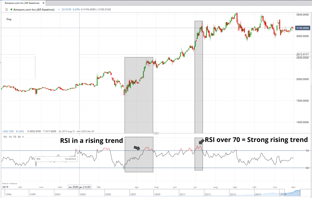
A momentum indicator measures and shows the strength of a trend. The most used indicators for this is RSI. When using RSI you usually set the strength values to 70 – 30. When the RSI is above 70, the rising trend is then considers very strong. When it falls below 30 the falling trend is considered very strong.
You can also look at the trend in RSI. If the RSI curve is pointing upwards, that is usually an indication that the price will rise, and vice versa.
2. Volatility Indicators (Bollinger Band)
Volatility is a measurement that shows the range of a price change over a period of time. High volatility means that the difference between the lowest and highest price point is large. Bollinger Band is an indicator that measures these movements in price. It shows how much the price usually changes by checking previous movements. When a price moves outside the Bollinger Band it is considered overbought or oversold, i.e. an overreaction. The expected result is that the price soon moves back inside the Bollinger Band again.
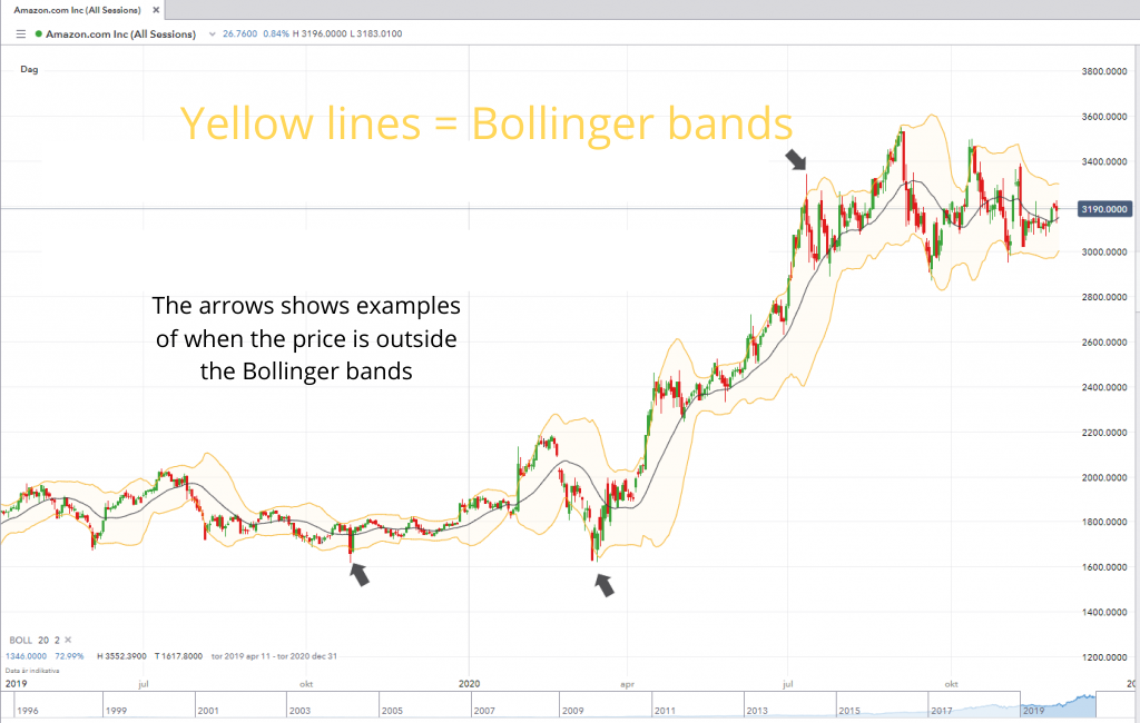
The yellow lines show the Bollinger Bands
Volume
By volume you usually mean trading volume, i.e. all the buy and sell orders that pass through the market. High volume means that more buyers and sellers are acting in the market. Low volume means that buyers and sellers are more reserved.
Volume is usually measured in two ways:
- Volume at price
- Volume at time
1. Volume at price
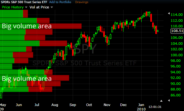
Volume at price measures the buy and sell orders that passes through at a certain price.
You usually look at volume at price to get an indication of where trading occurs, in order to find support and resistance in the marketplace. If you, for example, notice that large volumes suddenly occur every time a share reaches 20 SEK, and that the price starts to point upwards at that price, you can draw the conclusion that there are many buyers that want to buy the share for 20 SEK.
2. Volume at time
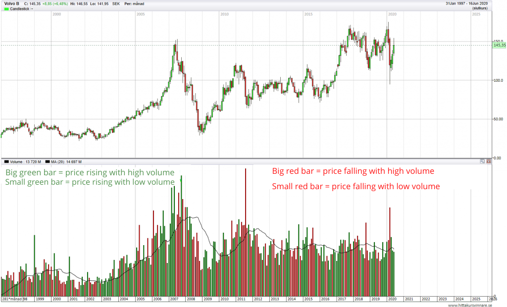
Volume at time means that you measure trading volume during a specific time period.
You can use volume at time as support for other tools. If, for example, a chart shows a ascending triangle pattern, while at the same time the volume is high, the probability of the price trend continuing increases.
Programs/platforms for technical analysis
There are many different programs and platforms you can use for your technical analysis. We use IG-markets to do our TA. Their platform is completely free to use and has all the indicators and tools you will ever need. You need to create an account at IG to use the platform, but it is free to open an account and use the IG platform.
Does technical analysis work?
Yes, technical analysis does work. It is a solid tool that helps you get an edge on the market, i.e. make more correct predictions than wrong ones. TA is an analysis method that many people use. It is arguably one of the reasons as to why it works. If everybody thinks a price will change at a trend line, it probably will.
Almost all banks, funds and financial institutions partly use technical analysis as a basis for buy and sell decisions.
After many years of using TA, our conclusion is that it is a good tool to have in your toolbox. We also believe that is EXTREMELY difficult to make money by using technical analysis alone.
A rookie mistake is to trust individual indicators within technical analysis – and think that that is enough. You need to use many different tools within technical analysis in order to create a sound strategy. When you have your strategy ready, your on your way, but still far away from the finish line. You also need good money management in order to make money by trading. There are no shortcuts – you need to spend time in order to get good enough to become a successful trader.
Many combine fundamental analysis and technical analysis to create an edge. One way is to use fundamental analysis to pick companies with a solid underlying business. Then you can use technical analysis to find the right timing on when to buy and sell.
What to consider before you start trading with TA
Always assume that you will lose money during your first years of trading. With that attitude you will save a lot of money. When you get better at it and have some experience under your belt, you will soon realize that you have only scratched the surface on what you can learn. If you are not prepared to give 100% to learn technical analysis and trading in general, it is probably better to not do it at all. It will almost certainly end up being the cheaper option. Instead you could focus on buying and selling stocks and funds long term.